CONTACT US
INDUSTRY
Consumer
Healthcare
PLATFORM
Mobile, Medical Device, Wearables
SERVICES
Design: UX/UI, Visual Design, Responsive Design, Packaging, Website, Motion Graphics
Research: Usability Testing
Strategy: Content Strategy and adapting a clinical OOBE to at home application
At a Glance

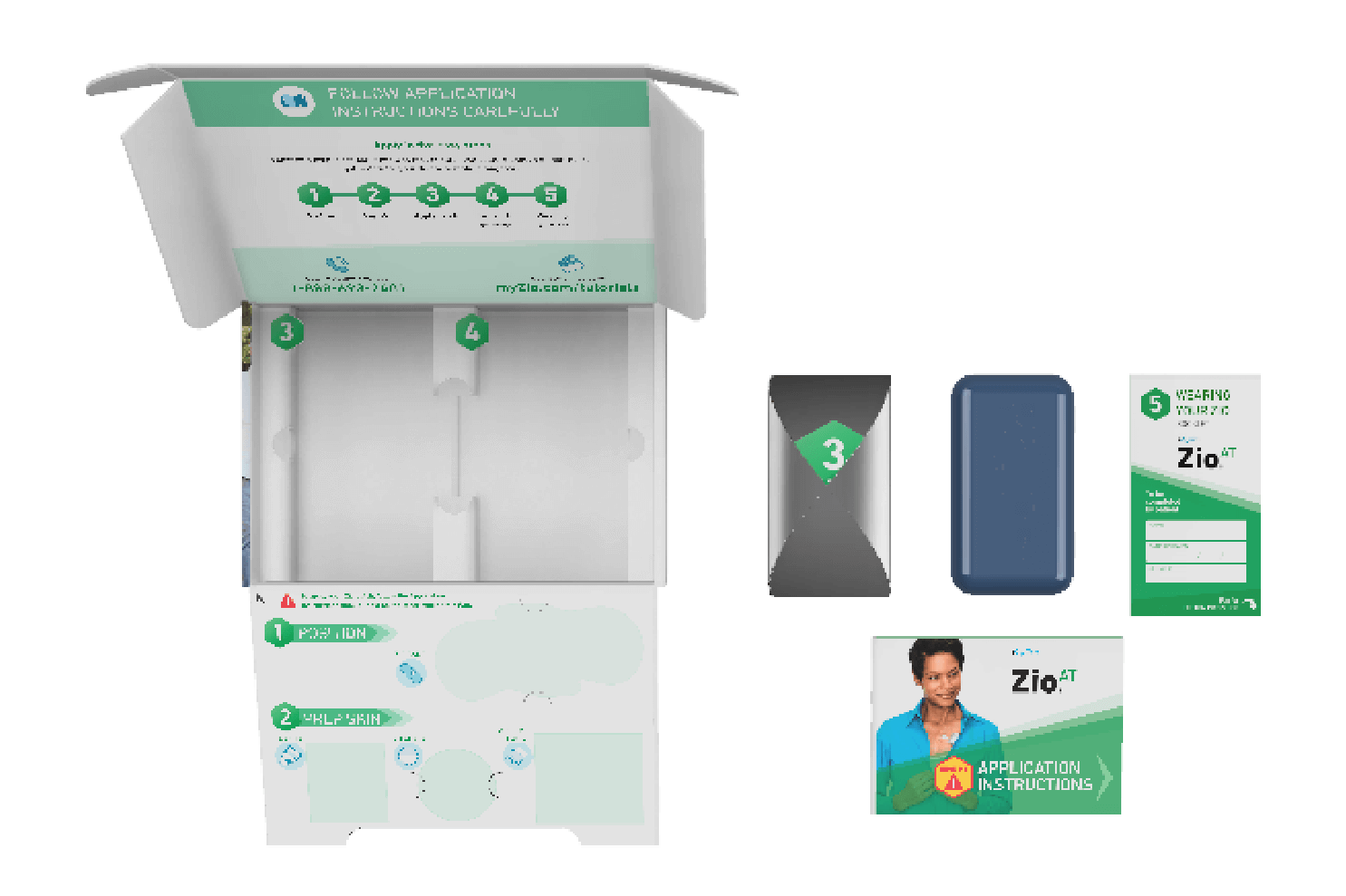
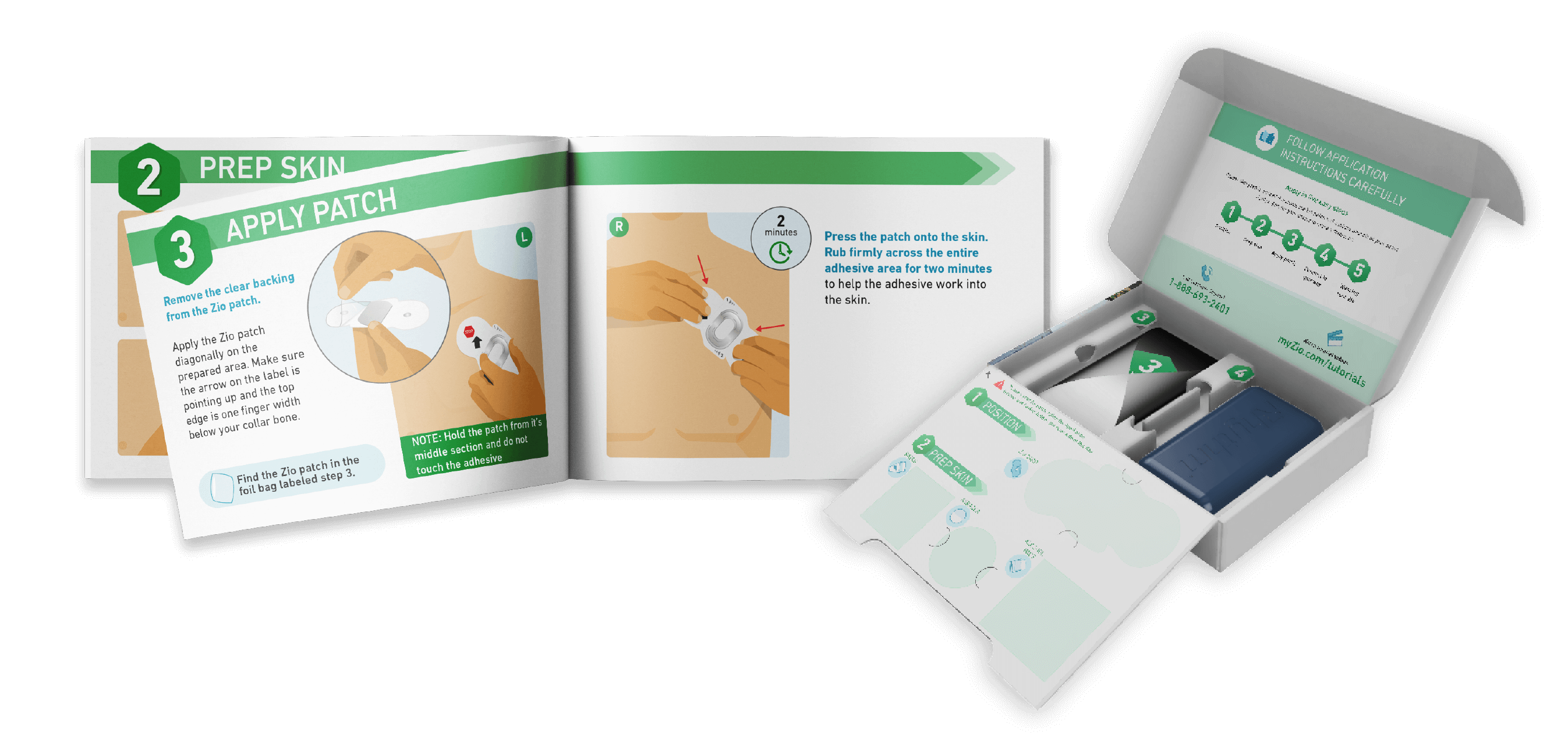
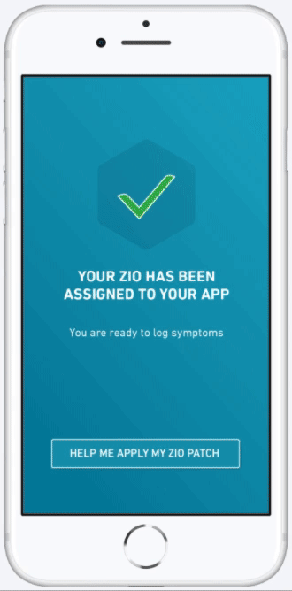
iRhythm approached us to help transition the Zio Patch, a wearable heart monitor, from the clinical setting to an at-home application process. The patch is worn by patients for up to two weeks and is trusted by physicians to monitor and detect irregular heart rhythms.


Through iterative research and design, we tailored the out of box experience for patients to successfully apply and manage their Zio in the comfort of their home.

The Challenge

The Zio Patch is a complex medical device generally used by a tech adverse population and applied by a medical professional in a doctor’s office. Our challenge was creating the new at home paradigm for this wearable that walked users through the process as simply and clearly as possible, eliminating information overload.

The Challenge Image
How we did it

Applying a heart monitor is an intimidating task, especially for an aging population, and our goal for the design was to deliver users confidence when going through the steps. The design needed to guide users through the lifecycle of the application process utilizing digital media and physical materials. Because Zio is applied at home, the new packaging and instructions would need to consider less than ideal environments, such as a bathroom with minimal counter space, as part of the final design solution.

How We Did It

Curvy line
Discovery 
 

Before any design work began, the team took the time to identify areas for improvement, challenge existing assumptions, and analyze potential competing factors to understand the customer’s view while keeping business and product goals in mind.

Concept Generation
 

With a solid foundation of understanding, the design team generated 3 packaging concepts and a mobile app design to explore a range of possible approaches and best understand user priorities.


  • Simplified: All content required to get started was grouped by tools and directions within the box, including a traditional format quick start guide, providing a familiar experience for the user.
  • Integrated: The quick start guide steps were printed directly on the box, condensing the number of materials inside, and progressive disclosure was implemented to reveal the necessary materials and directions as they were relevant.
  • Flexible: Quick start guide could be read traditionally as a booklet or used as sticky notes, revealing 1 step at a time. The box itself featured minimal flaps making it an easily moveable workspace.
How to image
Research
 

Multiple rounds of iterative user testing were conducted to understand where users naturally went to consume various types of instructional information and the limit for how much information could be absorbed during each step.

The
Outcomes

The final design resulted in packaging and instructions that are quickly understood and visually directs the user through the set-up process. Instructions are printed directly on packaging for those who need physical materials, and they were also augmented into digital materials for more tech savvy users. The end result was an OOBE that was simple, clear and accessible for any type of user.

Image
Image

Similar projects

Let's Get Started!
Call Or Email
408.297.2445
With UEGroup, you’ll interact directly with a senior member of the team to ensure your needs are understood and translated into action.
You will hear back from us in a few hours on business days.
Interested in participating in a research study?
Click here to fill out a survey.
Go To Full Contact Us Page ⟶
Accessibility Menu